Project Background
Context
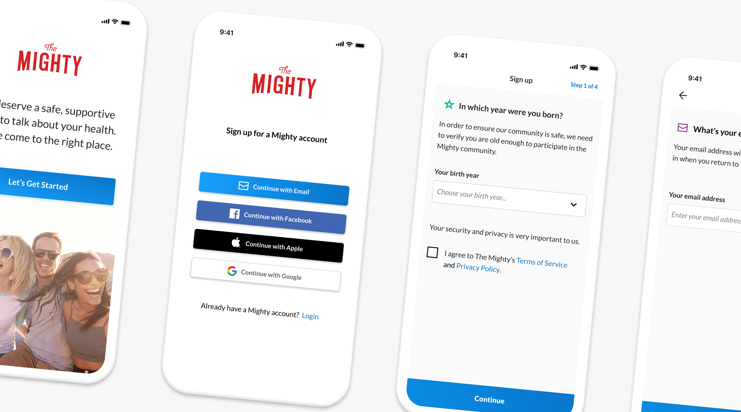
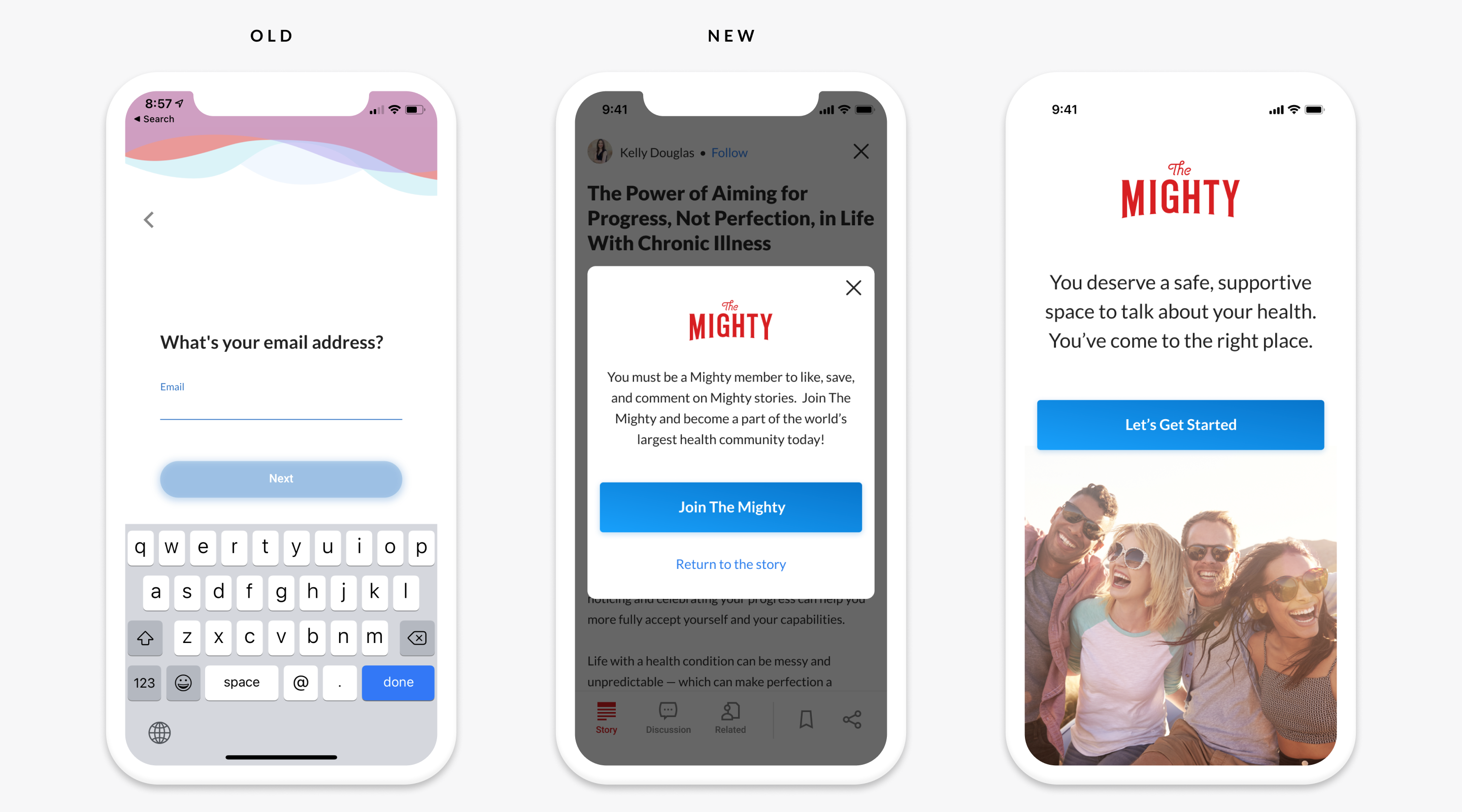
The majority of people who find the The Mighty do so by way of Google searches that lead them to articles which are interesting and/or relevant. It’s not necessary to be a Mighty member in order to read and many potential users never do join The Mighty (another topic altogether). Once these ‘lurkers’ attempt to interact with articles though by liking, saving, or commenting, they are prompted to become Mighty members, a process that was awkward and cumbersome that only 22% of prospective members successfully completed. It was imperative that The Mighty improve the rate at which people successfully completed their account creation process.
My Role
I was the sole product designer, working in conjunction with a cross-functional team that included the product management and engineering leads and incorporated inputs from content design, QA, privacy, and legal stakeholders.
Approach
I mapped out the existing account creating flow, noting all the spots at which we observed user drop-off, while simultaneously performing a heuristic evaluation which was intended to help identify the issues leading to the flow’s poor performance. Through these efforts a set of requirements was created and the design process began.
Problems & Solutions
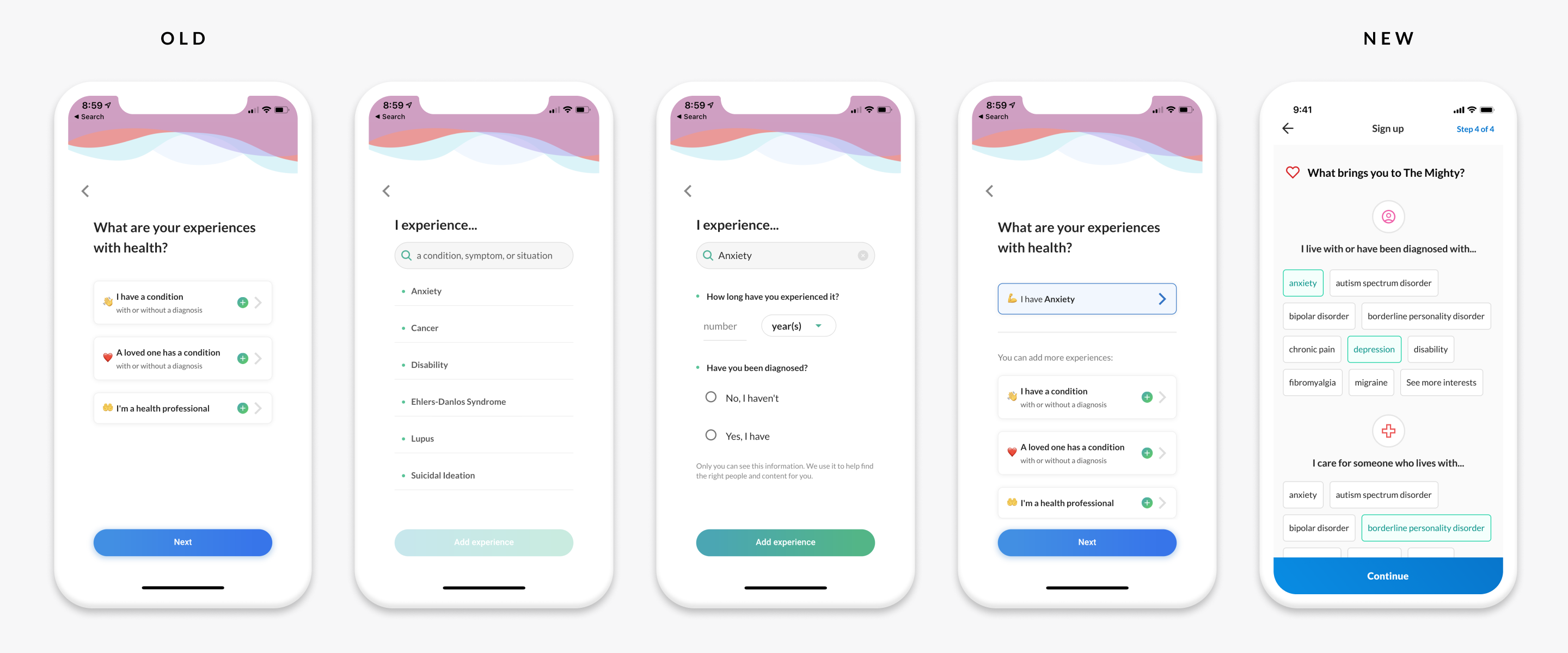
An Arduous Process
The Solution
An Abrupt Transition
The Solution
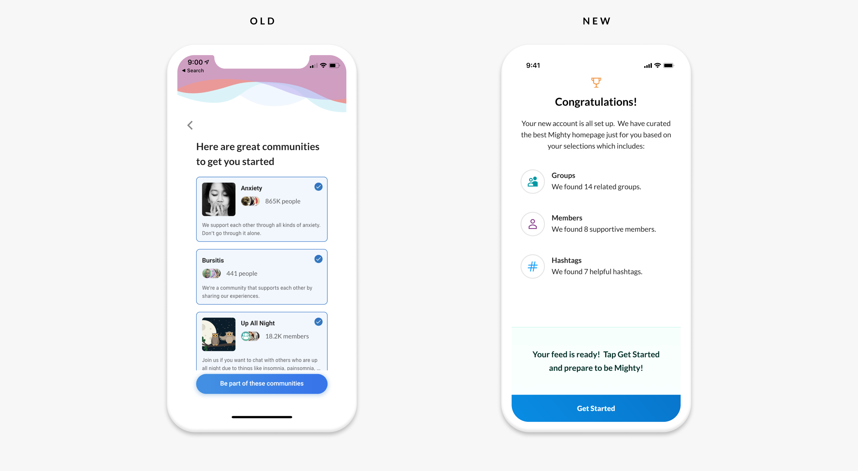
An Unintuitive User Experience
The Solution
The Outcome
>15
Number of screens removed
32 sec
Average time to completion
78%
Success rate
+ 355%
Success rate % improvement
Ready to make something awesome? Let’s talk!
If you have a product to design please don’t hesitate to reach out. I have helped some of the world’s best known brands achieve big successes and I would be delighted to do the same for yours.


