
Online Fulfillment Redesign
Project Origin
The online system through which Starbucks ordered promotional and other in-store materials for their retail stores, known as Promonet, was outdated, offering a poor user experience that led to considerable wasted time and money. Store and district managers, buyers, and marketing teams had little insight into the status of store promotions, causing excessive amounts of back-and-forth communication among team members.
I was engaged by Starbucks to redesign this system, improving its ease of use and incorporating functionality that would make the processes of ordering and tracking promotional materials much more efficient. Additionally, I aimed to give its user interface a more modern appearance that better reflected Starbucks’ branding and the contemporary aesthetic of the time.
The Process
User Research
The redesign effort began with an assessment of the existing Promonet web application, which included a heuristic evaluation as well as user interviews designed to better understand the platform’s users and their pain points with the existing system.
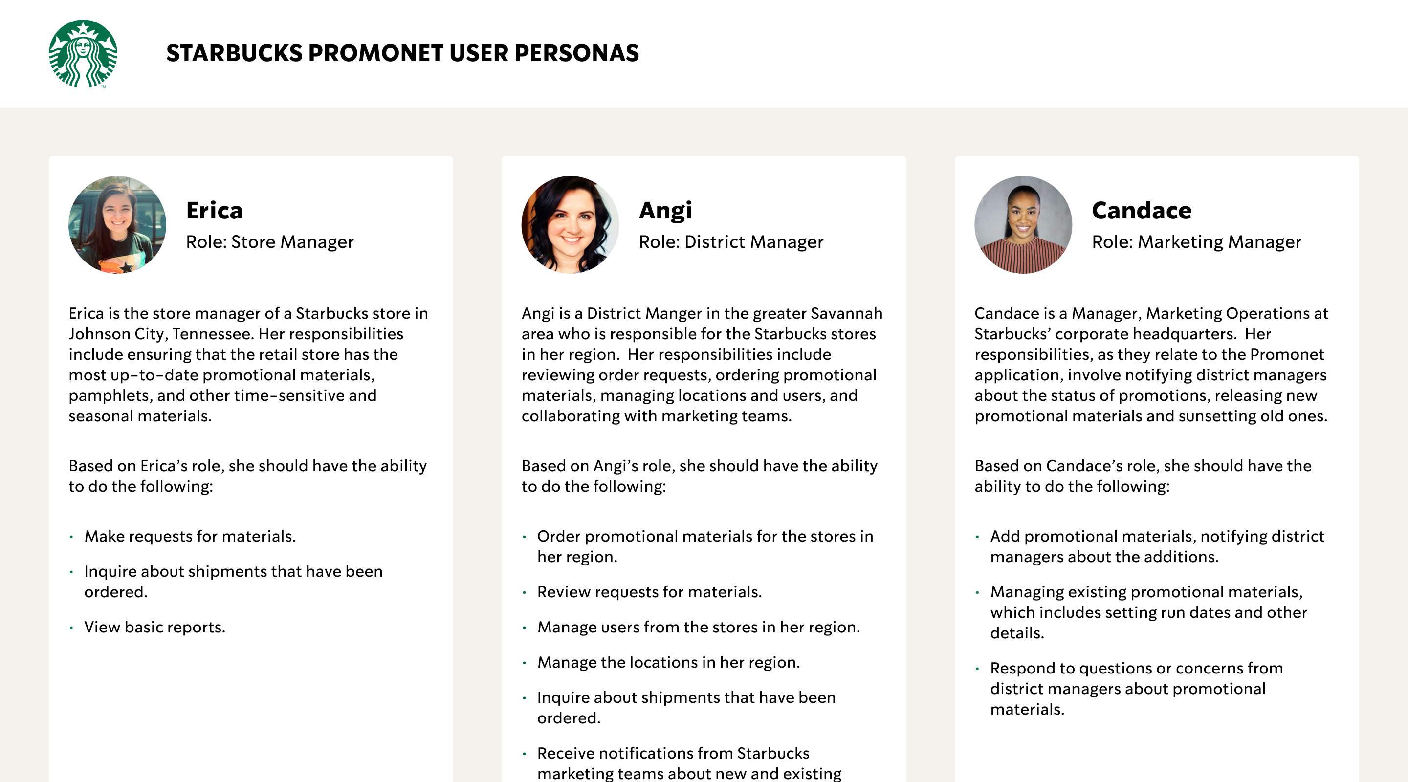
The immediate outcome of the project’s research phase was a Functional Requirements Document that defined the needs of various user personas and the functionalities that would best address those needs.
Information Architecture
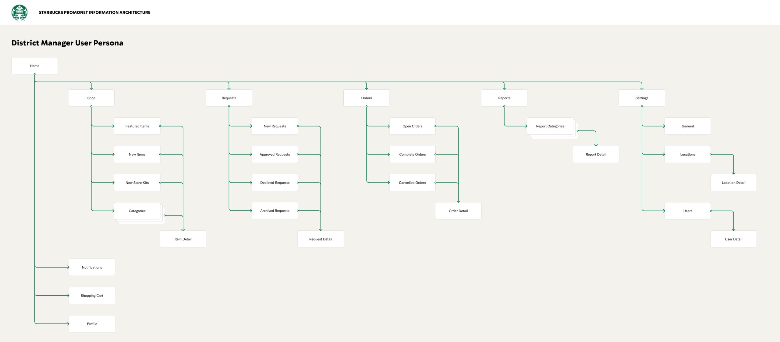
With a deep understanding of the needs of the various user personas and equipped with the newly-defined requirements, a well-structured Information Architecture was developed that would dramatically improve the platform’s user experience, enabling its users to quickly locate the content and functionality they’re looking for, ultimately saving Starbucks time and money.
Low Fidelity Design
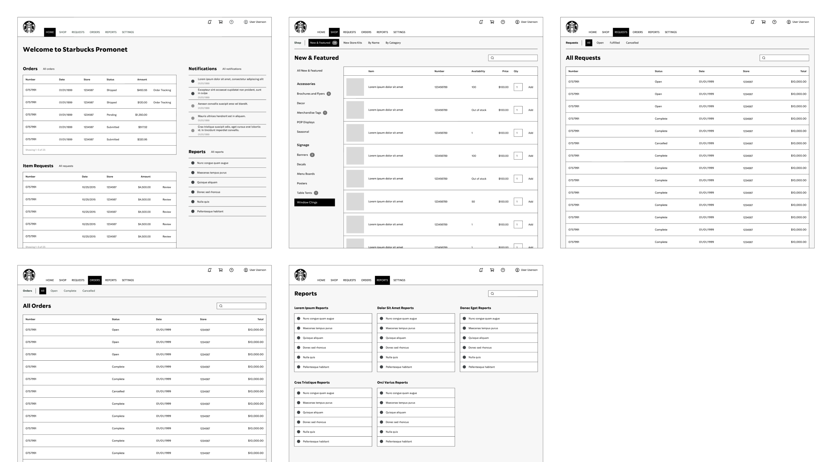
With requirements and a newly-defined Information Architecture in place, I progressed to the project’s Low-Fidelity Design phase. In order to visualize the interface’s basic structure and layout in a way that could be rapidly iterated upon, wireframes were created that defined key elements and interactions.
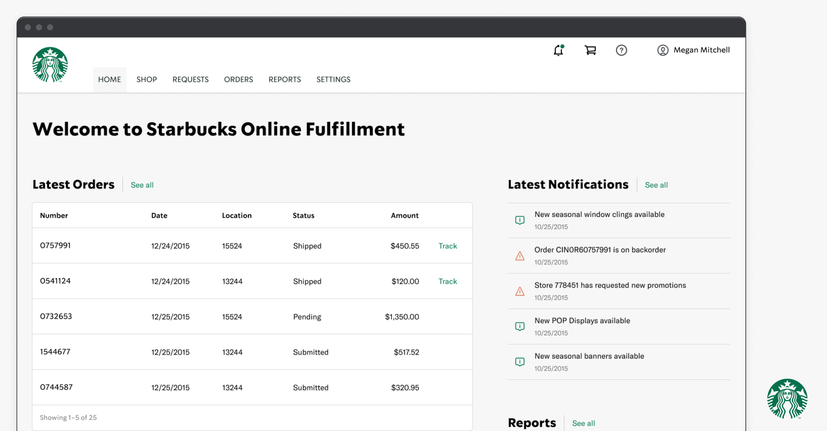
High Fidelity Design
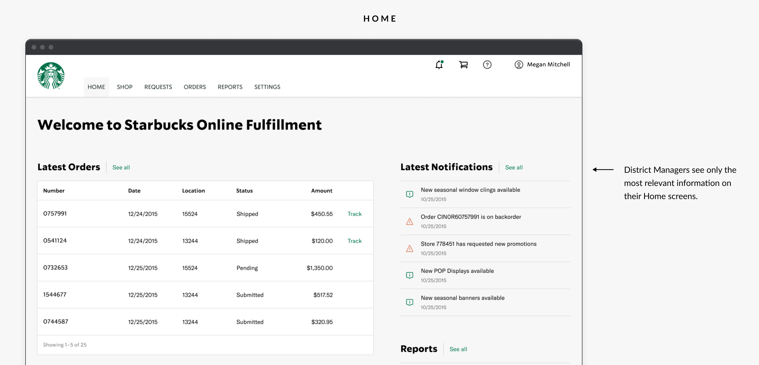
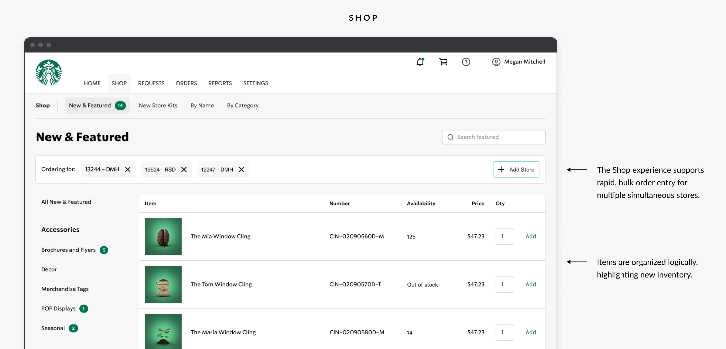
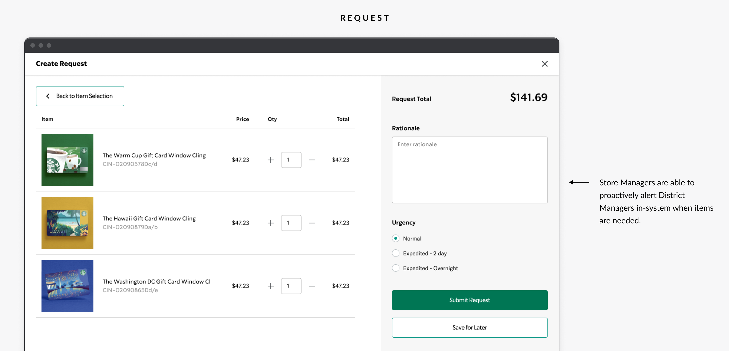
With a low fidelity design validated by extensive user input, primarily in the form of usability testing, I was able to advance to the high fidelity design. Each screen presented only the most relevant information, promoting the functionality that best supported the tasks users needed to accomplish.
In Conclusion
The Starbucks Online Fulfillment project was a success by all metrics, including a significantly improved user experience that reduced order processing time for both simple and complex orders. Furthermore, the feature allowing Store Managers to generate in-system order requests resulted in significant time savings.
Ready to make something awesome? Let’s talk!
If you have a product to design please don’t hesitate to reach out. I have helped some of the world’s best known brands achieve big successes and I would be delighted to do the same for yours.
Contact Me